A Richly Detailed Edwardian Makeover
Posted by admin on
A Richly Detailed Edwardian Makeover
Architecture
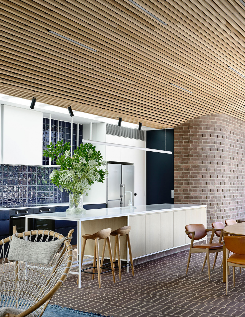
Miyazaki Bar stools by Great Dane Furniture. Kollon Vase on counter from Great Dane Furniture. Styling – Swee Design. Photography – Derek Swalwell.
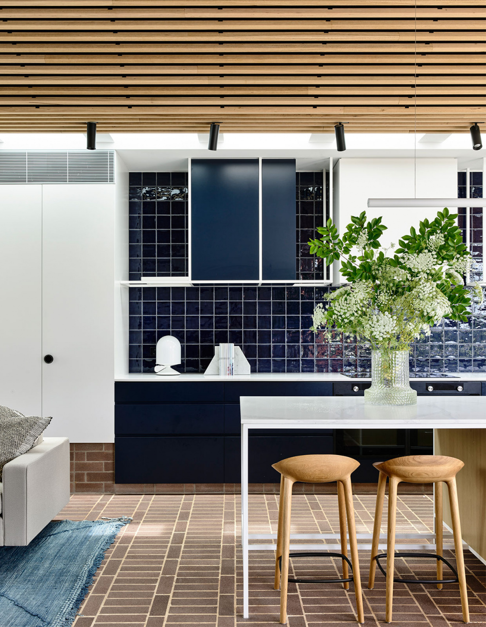
Vinge lamp from Great Dane Furniture. Ligne Roset Bookends from Domo. Miyazaki Bar stools by Great Dane Furniture. Kollon Vase on counter from Great Dane Furniture. Styling – Swee Design. Photography – Derek Swalwell.
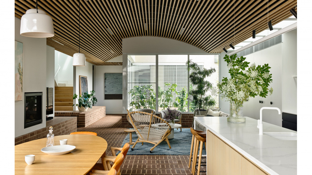
Johansen Table Oval by Great Dane Furniture. Kai #42 chairs by Great Dane Furniture. ND83 armchairs by Great Dane Furniture. Circle chair by Great Dane Furniture. Lean Floor lamp by Great Dane Furniture. Pond side table oak by Great Dane Furniture. De Sede DS-612 coffee table in white from Domo. Plants from Glasshaus. Rug from Halcyon Lake. Leaning artwork by Amber Wallis from Nicholas Thompson Gallery. Hanging artwork on rear wall by Miles Hall from Nicholas Thompson Gallery. Ceramics by Mark Young. Styling – Swee Design. Photography – Derek Swalwell.
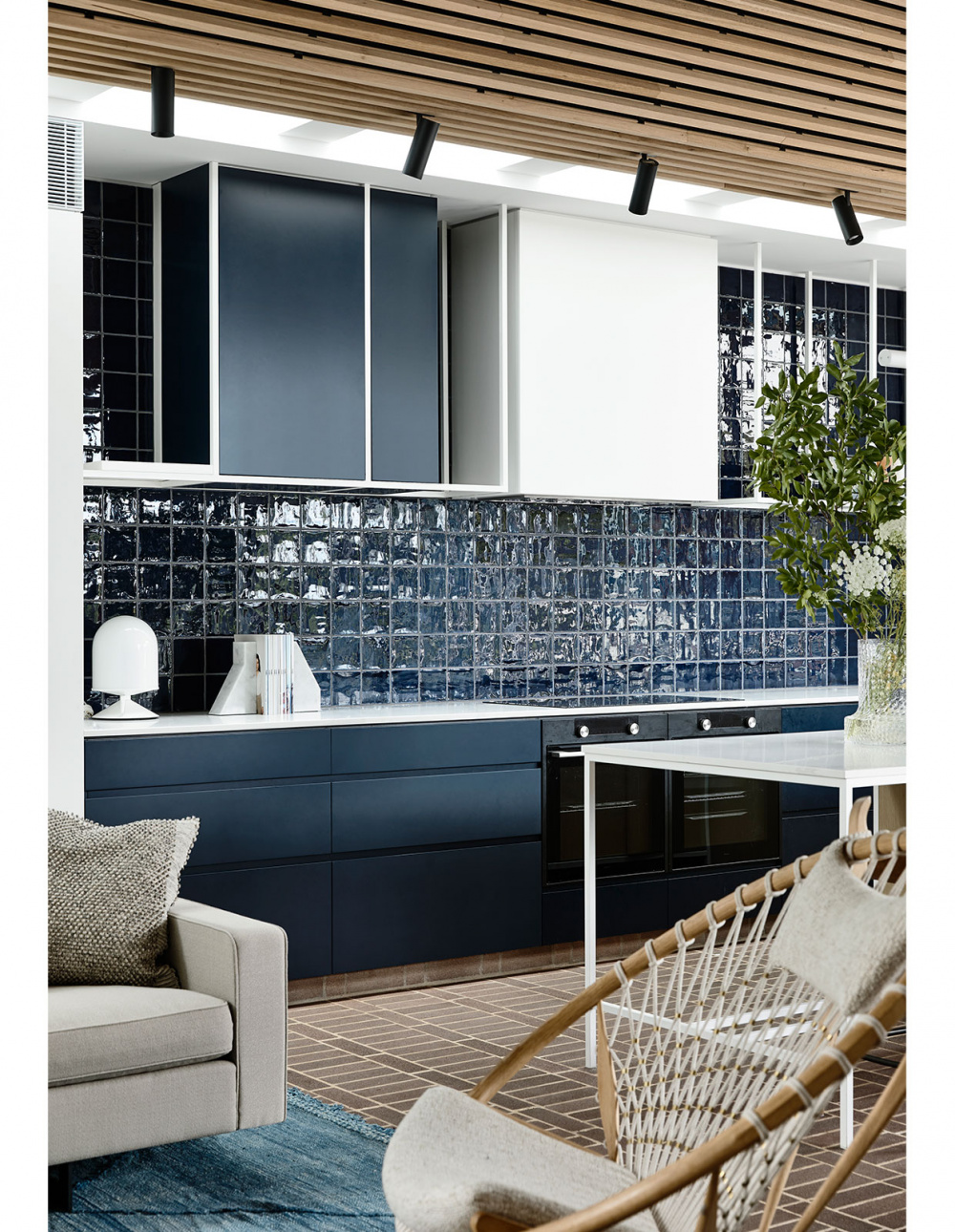
Vinge lamp from Great Dane Furniture. Ligne Roset Bookends from Domo. Kollon Vase on counter from Great Dane Furniture. Circle chair by Great Dane Furniture. Styling – Swee Design. Photography – Derek Swalwell.
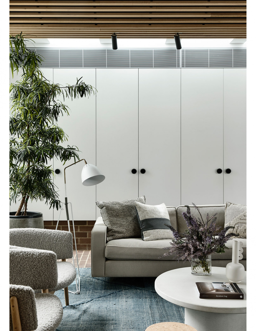
Rison Sofa by Great Dane Furniture. Cushions on sofa from Great Dane Furniture and Halcyon Lake. ND83 armchairs by Great Dane Furniture. Circle chair by Great Dane Furniture. Lean Floor lamp by Great Dane Furniture. Pond side table oak by Great Dane Furniture. De Sede DS-612 coffee table in white from Domo. Plants from Glasshaus. Rug from Halcyon Lake. Styling – Swee Design. Photography – Derek Swalwell.
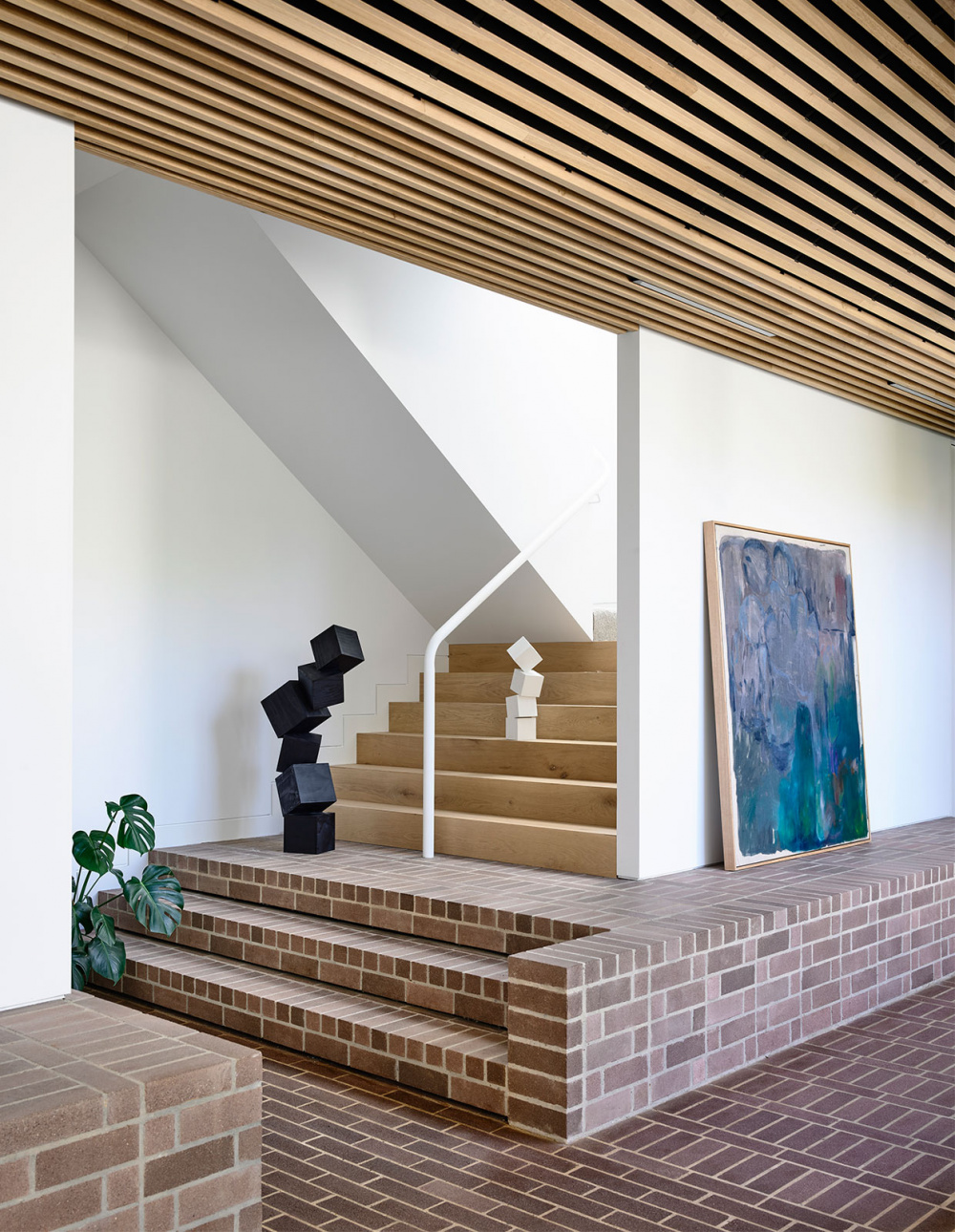
Leaning artwork by Amber Wallis from Nicholas Thompson Gallery. Sculptures by Mark Galea. Styling – Swee Design. Photography – Derek Swalwell.
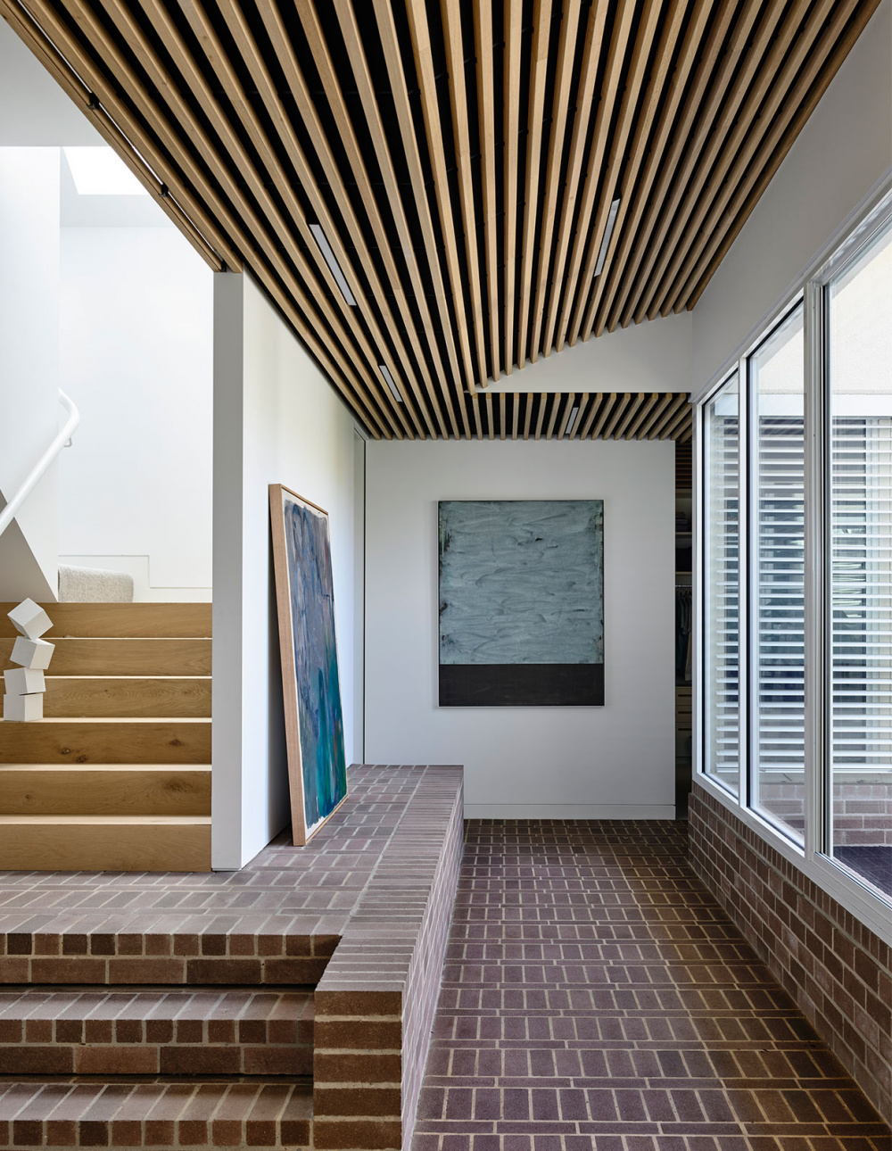
Leaning artwork by Amber Wallis from Nicholas Thompson Gallery. Hanging artwork on rear wall by Miles Hall from Nicholas Thompson Gallery. Sculpture by Mark Galea. Styling – Swee Design. Photography – Derek Swalwell.
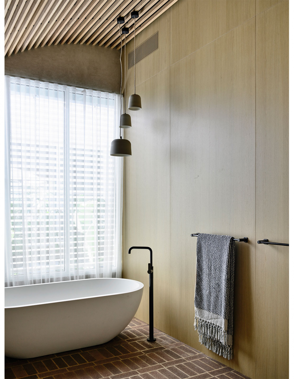
Towel by Loom Towels. Styling – Swee Design. Photography – Derek Swalwell.
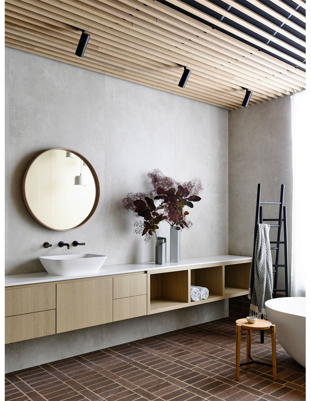
Ligne Roset Cells vases from Domo. Ligne Roset Passe Passe coat rack from Domo. Ligne Roset Rift Table/Stool from Domo. Towels by Loom Towels. Styling – Swee Design. Photography – Derek Swalwell
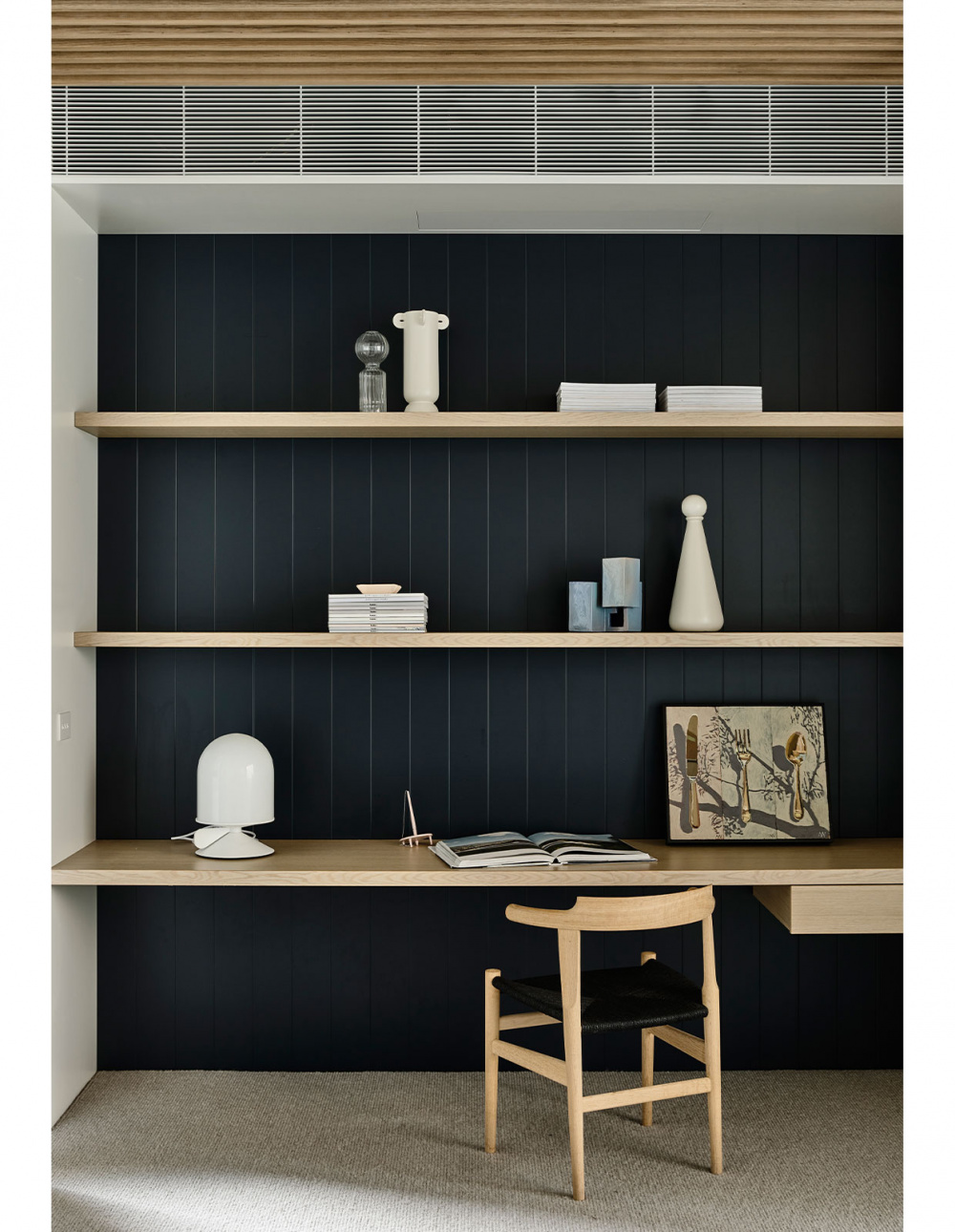
Hans Wegner 58/68 Chair by Great Dane. Art by Andrea Wilson from Studio Gallery. Vinge table lamp in white, from Great Dane. Ferm Living vase from In Good Company. Styling – Swee Design. Photography – Derek Swalwell.
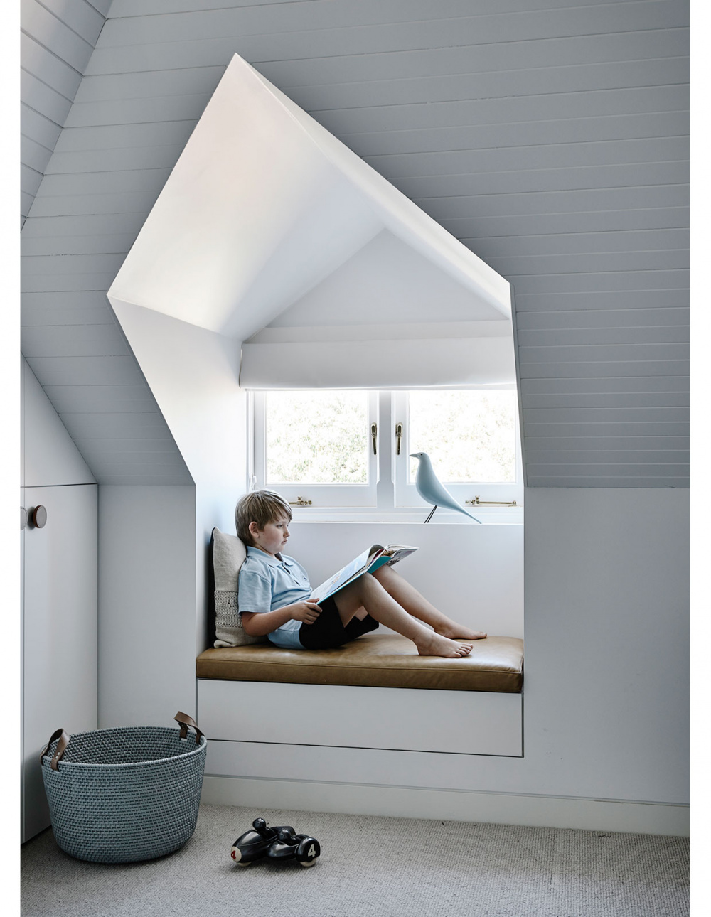
Styling – Swee Design. Photography – Derek Swalwell.
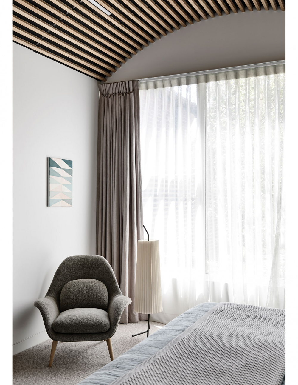
Swoon Lounge Armchair by Great Dane Furniture. Fliegenbein Standing Lamp from Great Dane Furniture. Art by Arryn Snowball from Nicholas Thompson Gallery. Styling – Swee Design. Photography – Derek Swalwell.
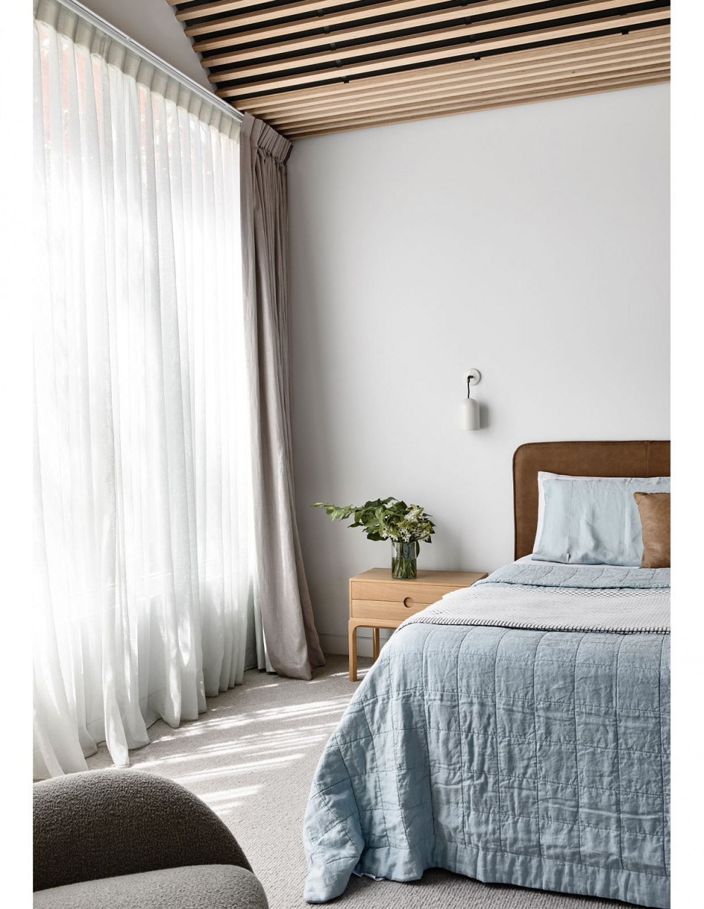
Entre 1B Oak bedside table by Great Dane Furniture. Styling – Swee Design. Photography – Derek Swalwell.
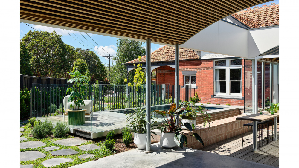
Landscape design by Mud Office. Plants from Glasshaus. Styling – Swee Design. Photography – Derek Swalwell.

Plants from Glasshaus. Styling – Swee Design. Photography – Derek Swalwell.
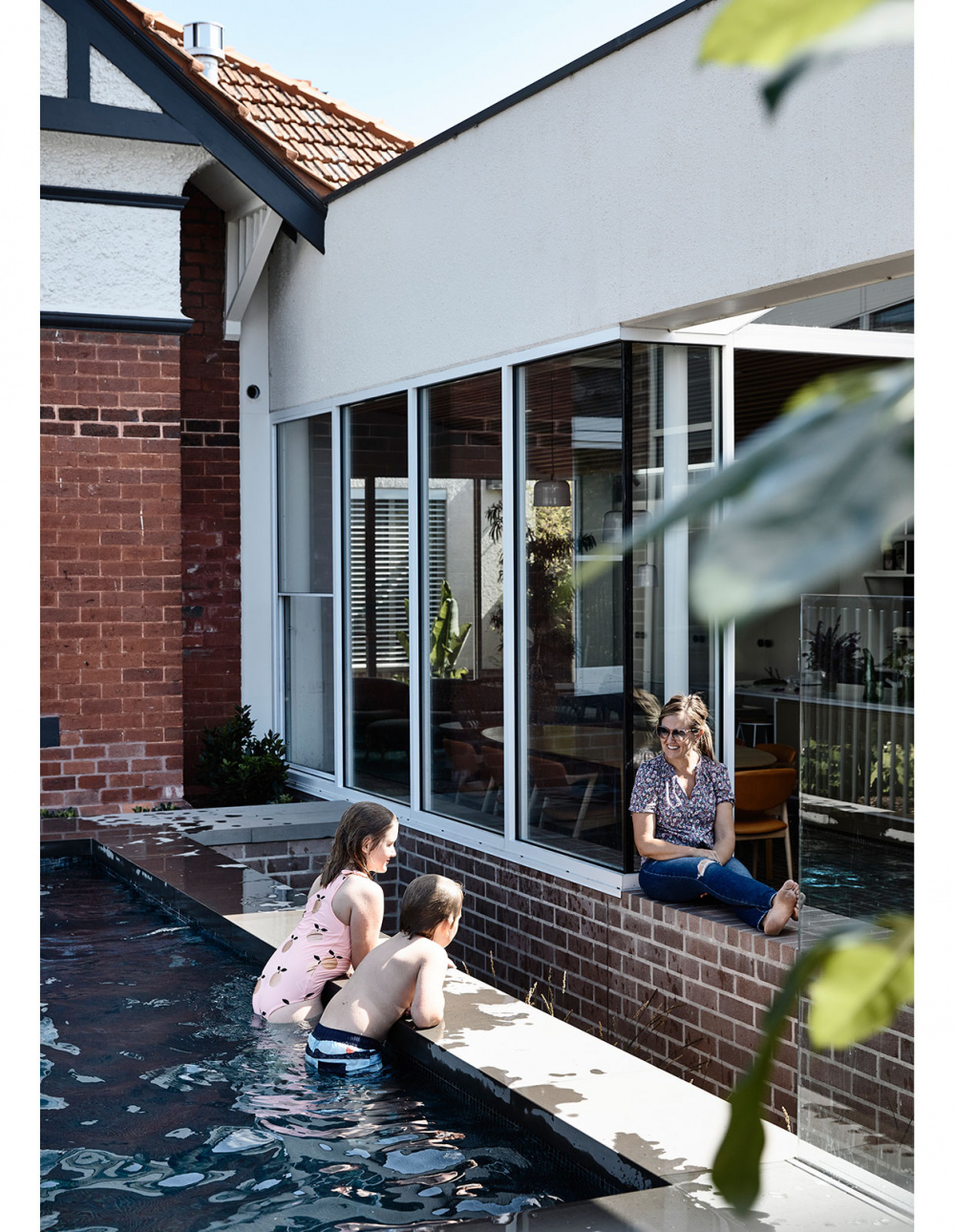
The pool! Styling – Swee Design. Photography – Derek Swalwell.
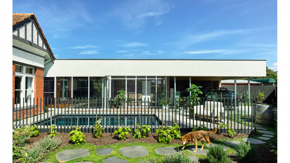
Pillow Lounge Chair from Domo. Plants from Glasshaus. Landscape design by Mud Office. Styling – Swee Design. Photography – Derek Swalwell.
The state of this Edwardian home in Caulfield East was a real mixed bag before its recent renovation. The grand period facade and several beautiful ceilings remained intact, but alterations added over the years were lacking in character and function.
The owners had worked with Architects EAT two times prior, so it was an easy decision to once again place their trust in the studio to work their magic and update the home.
Initially the brief called for an ‘out the back’ first-floor extension, with a new double garage, but Architects EAT devised an alternative more conducive to the generous block.
‘We have given them a long, single-storey addition with an attached carport that is opened to the pool and the garden,’ says Albert Mo, director Architects EAT.
A small section of the extension containing the new main bedroom meanwhile wraps around the rear of the existing home, to form an L-shaped plan.
‘Like a traditional carpenter’s square, it is ‘sharp’ like the long steel blade, while the ‘soft’ timber handle houses the main bedroom,’ says Albert.
In contrast to its simple form, the interiors are richly detailed, with materials reflective of the original architecture. Most notably, the dusty purple brick band on the facade has been amplified to become the interior floor and walls, while the concave battened ceiling is a contemporary interpretation of decorative period styles.
‘The clients have total trust in us, and we don’t take this lightly. I think we have had to convince ourselves first before even suggesting to the clients!’ says Albert. In saying that, it took us a while to convince them with a total brick floor. At the end it was the trust that got us over the line.’
Responding to the context, the front garden by Mud Office and new pool now serve as a mediating space between the house (both the new and existing areas) and the street.
‘When the sunlight hits the water, it reflects a beautiful moving pattern onto the restored pressed metal ceiling,’ says Albert.
With its interesting interior detailing and improved floor plan, the home is now a perfect marriage of utility and aesthetics.
