Free Digital Scrapbooking Template, Free Scrapbooking Kit and Full Instructions on How to Digital Scrapbook
Posted by admin on
A very warm welcome, crafters and page artists.
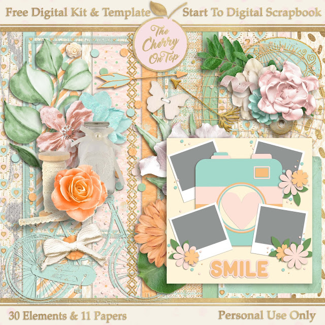
Today, we've got a full scrapbooking tutorial on how to use our free scrapbooking template, embellishments and free digital papers. (If you missed out on those, click here to get them.) You can scrapbook simply and quickly by using digital templates.
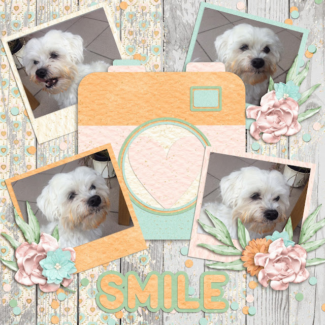
The example today is just a layered digital background, but don't worry. We are giving you that background in the form of a free digital templates.
Click the image or here to get to the awesome blog and download this free digital collection of papers, elements and sticker sheet. Be sure to check out all of the awesome provided in Design Bundles Plus where you can find wonderful designs for scrapbooking and designing.
A Digital Scrapbooking Tutorial for Beginners
Let's dive right in so you can see just how easy it is to scrapbook with our free digital scrapbooking template, embellishments and papers. We are keeping it simple, today. So even if you've never scrapbooked before, you can do it. Traditional scrapbookers can follow our lead, too and scrap-lift our page for a traditional scrapbook. Here' another blog for step by step instructions on how to do scrap this with paper and a free template.
I'm using an awesome scrapbooking software program, PhotoShop Elements. It is designed specifically for scrapbooking and it is very user friendly. It is similar to PhotoShop. Just easier, in my opinion.
Step 1) Open the free template and clip in any other paper you might want to use over layer 1 and 2 by right clicking and choosing, clipping mask. (You could keep it as is.)
Step 2) Go to the layers panel, click on the background layer and right click/duplicate layer. Size the new layer that you'll use for your picture.
Step 3) Duplicate your new photo spot if you'd like another spot and size and place them how you like on the background paper.
Step 4) Slide in your photos from the gallery, over your photo spot and right click, clipping mask them.
Step 5) Go to the effects panel and add some shadows if you like. These are installed shadows with a lot more options than the ones from the software. Design Bundles has shadow add ons, too. If you’re interested, check out Shadowify or others like it. I'll be back with more tutorials on how to tweak and play with effects both from the software and from purchased add ons.
Step 6) Start sliding in your elements and moving them around the page with your mouse and the left click.
Step 7) When you've got your elements where you want them, consider adding shadows. It really gives your page dimension and looks totally awesome. It's a great way to add lift and contrast, too.
Step 8) Move your design exactly where you want. (Mine was a little too low. The easiest way was to "Select All Layers” at the top toolbar, deselect the paper layers by left clicking on the them, as shown in the layers bar in the below image and then left click and move the entire grouping to your desired location.)
There! That's more centered and now there is a lovely spot for a title.
Step 9) Go to the left toolbar and click on the color picker and choose a color from your layout that will work for your title. I went with the bluish color.
Step 10) Also in the left tool bar is a big green "T". There you will pick a font that matches the style of your page. (We'll be back with a lot more tips on fonts, too.)
We definitely have a kind of whimsical style going on for our page. So a whimsical, script font will be perfect.
Now, you could stop there, but if you want to keep working, follow along and learn a few more cool tricks.
Step 11) Slide a paper over your font layer and left click, clipping mask to clip it to your font. This will give texture and it'll match your page perfectly as well.
We're going to take another step further.
Step 12) Add a stroke to your title by going to the Effects menu and choosing "strokes". Left click on the one you like best.
By default, you'll get a black stroke, but that can be changed easily. The black really does not go well with our soft pastels. If there were more black introduced it might.
Step 13). Go over to the layers bar and quickly double click the tiny fx symbol on the layer you wish to add a stroke, which would be the font layer. This extra menu will pop up. Left click on the black box.
Yet another box will pop up. I hope I've not lost you so far! Now is your chance to color pick the exact color you want for your outline or stroke.
Step 14) Choose your stroke color and click ok. Make sure the stroke is the size you like. You can still change it by sliding left or right. Hit ok when it's perfect.
Step 15) Consider adding a shadow under your text. You can click right in the same menu box as the stroke. It's closer to the top. You can also see how you can easily make adjustments by sliding left and right on all three shadow options, which are size, distance and opacity. We'll be talking a lot about shadows in future blogs.
You could finish there. I went and added a big layer of paint over my background and clipped in the coordinating pink paper so it all matches. I love using anchoring elements like confetti, scatter, splatter, stamps and paints to anchor my elements and photos to the page.
It's a great way to add more interest, color and or contrast your pages.
So, how did you do? Easy, right? If you found it difficult, don't give up. It may take a few go's until the process gets smoother. I did change out just a few elements and added a few more awesome ones. You’ll love the changes!
I've got a lengthy video where I hold your hand and we digital scrapbook together. There's even another free kit and template for you!
I hope you've found this scrapbooking tutorial helpful and that you'll come back for more awesome free digital scrapbook stuff, tutorials and craft inspiration.
Happy crafting!


